XT4 Brochure
XT4 BROCHURE
Creating the first 2.0 brochure for 2021

Created storyboard and lead intro animation storyboard and lead the art direction.
THE BASICS
COMPANY
Cadillac
TEAM
Leo Burnett
TIME
5 Months
MY ROLE
User Experience Designer
THE CHALLENGES
This was the first vehicle for 2021 to incorporate UI/UX enhancements for the digital brochures. This brochure in-particular was unique due to the fact we were updating the interaction model in parallel to the creative work and layouts for client review. Unfortunately this was unavoidable due to the tight deadline for the release and the amount of product and legal approvals needed.
CHALLENGE #1
Redesigning exterior chapter interaction
Our team in our initial audit of the 2020 brochures found that the current interaction model quite confusing, particularly for the Exterior chapter. Our team established 3 key areas that we wanted to address:
Changing exterior color or trim will cause the experience to restart
Disconnection of having the exterior color selector not apart of the Exterior chapter
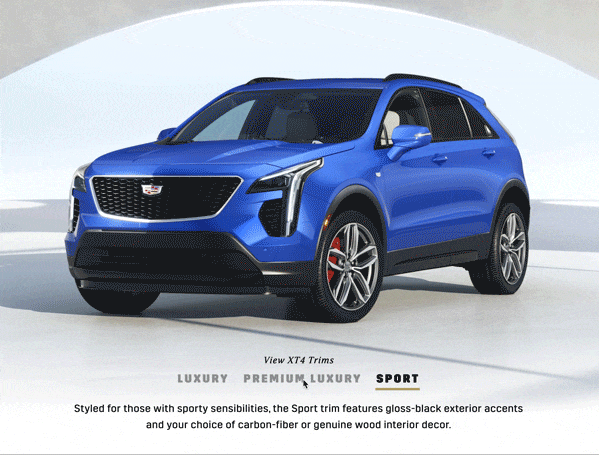
Trim comparison slider isn’t clear what trim is shown.
SOLUTION
Restarting the experience
In the current brochure anytime the user changes the paint color or trim the experience will restart no matter where you were in the experience, you’d be brought back to the beginning. This caused much confusion, and almost read as a mistake instead of an UI choice. So this functionality was removed and achieved by removing the realtime aspects of the brochure and the personalization of the brochure itself.
AFTER
BEFORE

Exterior Paint color not in exterior chapter
In the old version of the brochure the introduction and first interaction one would have was color chip selector for car paint then would lead into the rest of the chapters. This wasn’t bad but this could be improved by managing the user expectations. By adding the exterior paint color to the rest of the exterior selectors this created a constant experience.

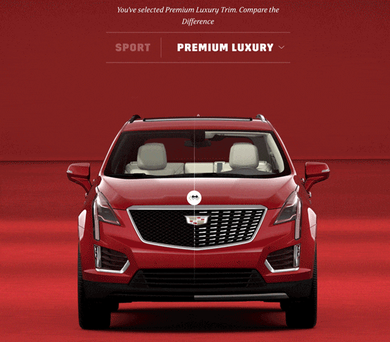
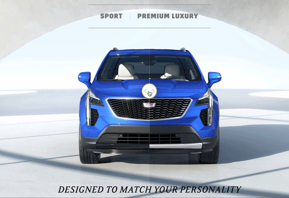
Trim comparison slider
Using the trim comparison sider there was no indication of what trim was shown, so our team to decided to add an active and inactive states to the trim labels. The trim label would appear bold when the slider revealed 60% of the vehicle trim vehicle. This ensure the user will always know what trim they are looking at. Lastly we added active state to slider button and increased the size to give the button more prominence on the page.
BEFORE
AFTER
CHALLENEGE #2
Adding animation controls
The 2020 digital brochure had an intro animation, which our team thought was very successful to increase intrigue. However there was no way to control the video. This was can be quite frustrating, especially when changing an exterior color and trim would restart the experience.
SOLUTION
On top of our team removing the restart functionality, we also decided to add a skip button, to give the user the ability to move ahead in the experience without having to sit and watch the whole animation.
CHALLENGE #3
the MEnu
The menu navigation in our initial audit housed too much information and it was hard to tell what chapter you were currently on. On top of having the chapter navigation styling, there were exterior and interior selectors that the user could customize. Overall these added pieces didn’t seem to add much value to the overall experience, especially since personalization aspect was being removed due to budget concerns.
SOULTION
To “de-clutter” the menu our team decided to with a fly-out with a gold bar to indicate what chapter you are currently on and removed all the exterior/interior selectors. To give the fly-out more hierarchy we added an overlay to push back the brochure in the background.
BEFORE

AFTER

CHAPTER INTERSTITIAL LAYOUT
In addition to updating the menu, there was a redesign of the chapter interstitials. Mainly to make the chapter number and title more prominent by placing the type on the top and having it horizontal instead of vertical orientation. We made the decision to redesign the scrolling icon to be a button. The old design had written instruction to inform the user, however we felt it was unnecessary and adding a down arrow button was more recognizable icon and more elegant solution.
BEFORE
AFTER
CHALLENGE #4
TRIM WALK
This was a late request by the client to add a comprehensive feature list of every trim for the XT4. This was a unique challenge for our team since there where many things to consider, where should the information live in the brochure and how to organize the content.
SOLUTION
Since part of the ask was to have the information be printable, team thought placing a downloadable PDF was the cleanest option. The trim feature list had to house many features and sometimes legal and product descriptions were even final until 1 week before launch. So having a “download PDF’ button that opens the trim walk in anther window was the fastest to implement and the easiest option give the circumstances. This button would live at the button of the specs and trims section, since this already housed a trim by trim breakdown of paint colors, wheels and interior options.

Lastly, a template for the layout document that other designers on team could follow for other nameplates. This would ensure that all the trim walks for other nameplates would be visually aligned.