Cadillac Brochure
CADILLAC BROCHURE
The next evolution

THE BASICS
COMPANY
Cadillac
TEAM
Leo Burnett
TIME
5-7 Months per vehicle
MY ROLE
User Experience Designer
THE CHALLENGES
As apart of the Leo Burnett I am brought onto many cadillac.com site to align branding across and unification across many teams; The digital brochures was no exception. I work with many teams such as product, developers, 3D studios and the clients to create a unified branded experience. Cadillac as a brand was moving away from the traditional printed brochures one might see at a dealership or at the Auto-shows.
When I started the digital brochure was being transferred from a previous design studio, which was fully transferred to our team in a matter of months. On top of being fresh team on the project, we also had to implement UX enhancements to further improve the experience. Our challenges were to:
Outline issues of realtime
Fix existing UX issues
Unifying cross platform brochure experiences
CHALLENGE #1
Define The Pain Points
When I came onto the project one of the biggest challenges our team faced. We first ran through the the digital brochures that are live; from there we outlined any UX questions we had and listed areas that we found confusing. After the initial review, we then met with the previous design team to design decisions and issue that tram faced. With a better understanding of the platform and assets used, we discovered that the 3D models we rendered in realtime. The positives of this was a fully personalized experience. However, the 3D was rendered in realtime unable to achieve the level of realism and the current platform couldn’t have the real time functionality taken away. The major struggles realtime 3D was the limitations for quality, time given for overall development and the lack of product team involvement.
SOLUTION
Our team decided to move away from the Realtime 3D rendering and limiting the amount of personalization of the brochure. But in sacrificing we gained better quality 3D assets. Other positives gained from having the 3D rendered in advanced was the time saved when we started to involve the product team, whose main role was to review to insure all vehicles/assets we were showing were product correct, a process that was new to Cadillac digital brochure.
AFTER
BEFORE
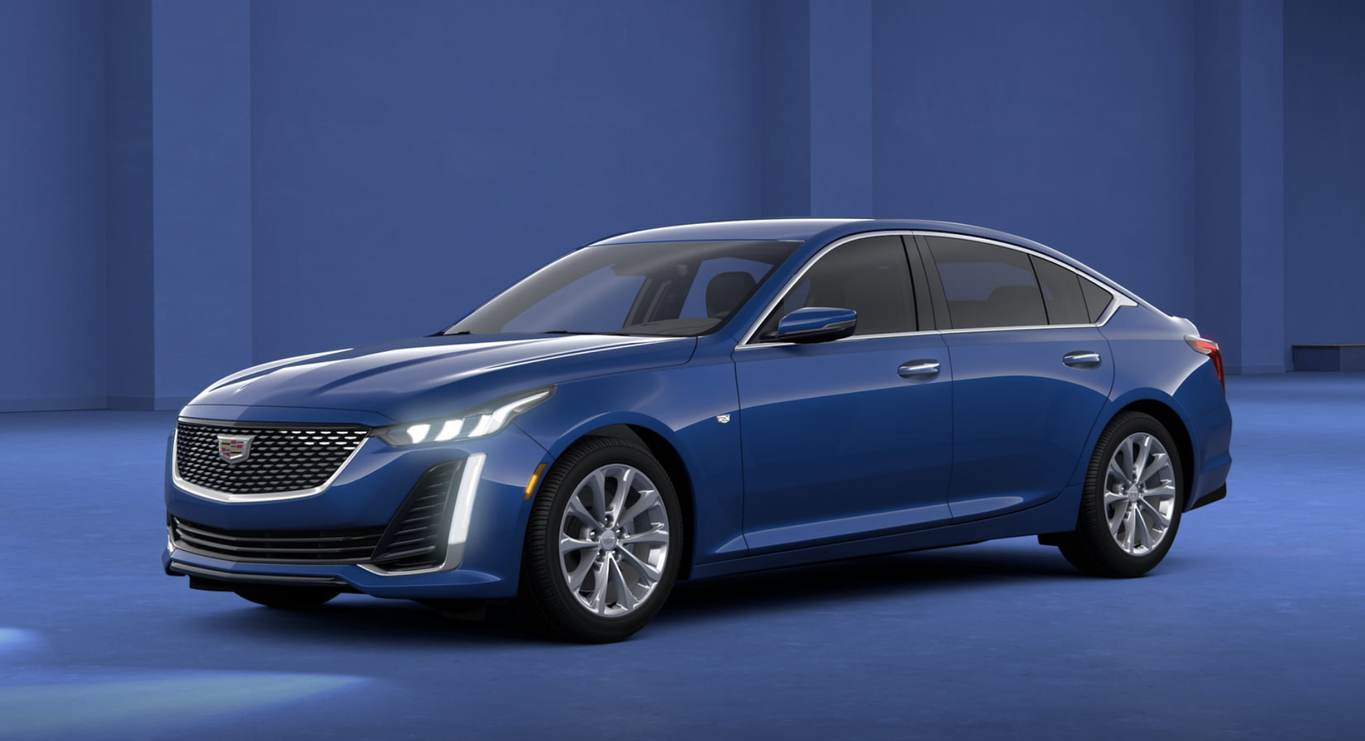
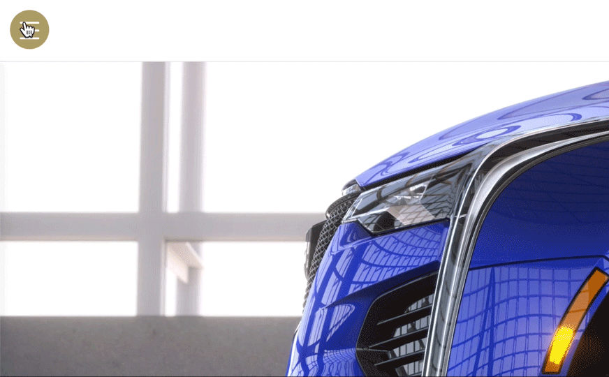
2020 digital brochure
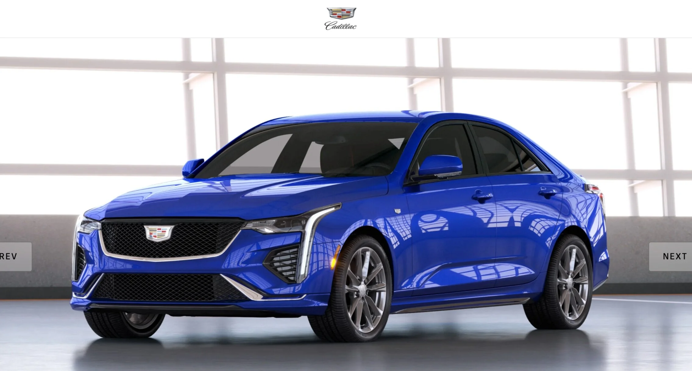
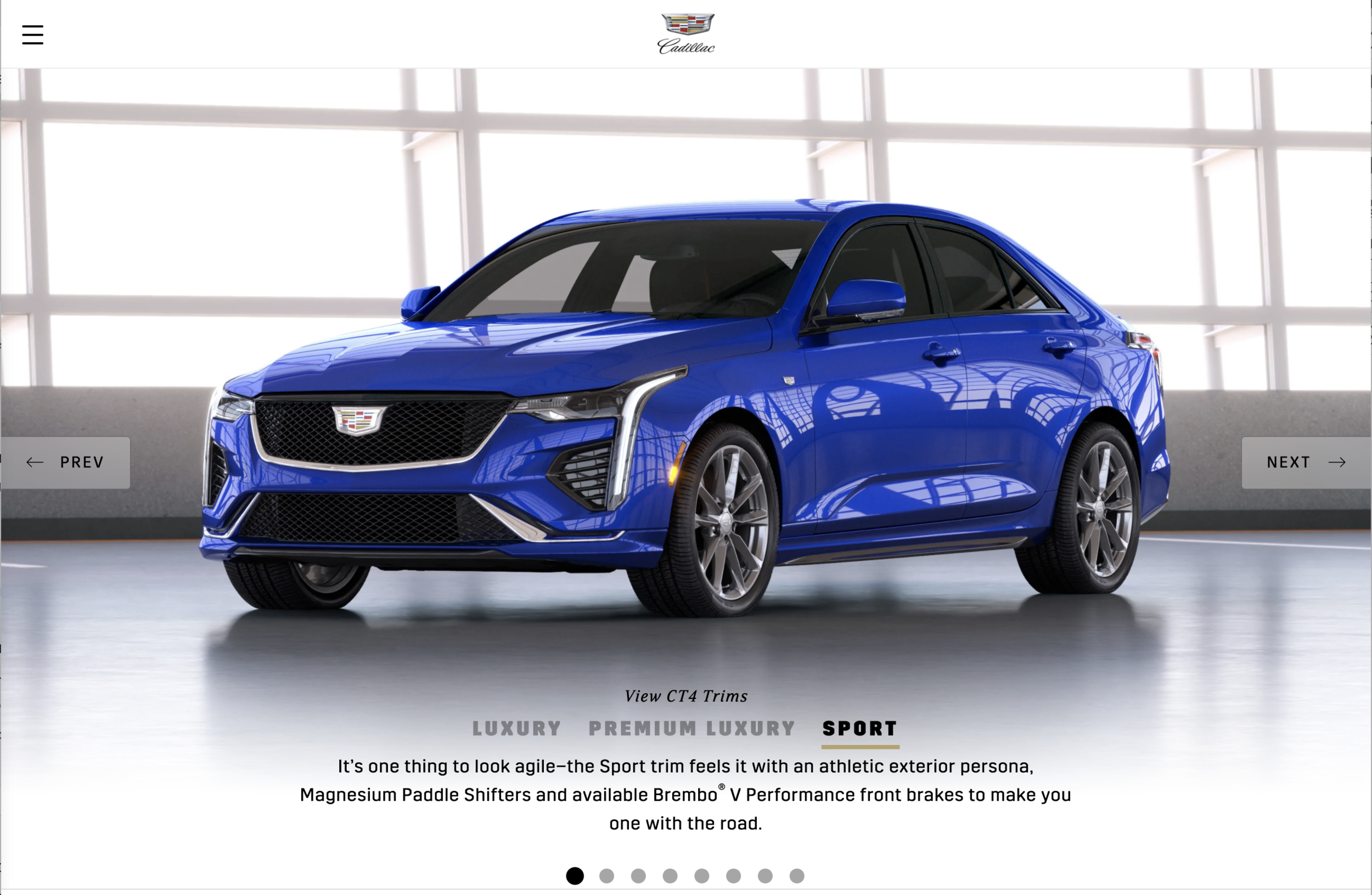
2021 digital brochure
CHALLENGE #2
Fix existing UX issues
After team did our initial audit of the digital brochure we came across several places that we could improve the overall user experience. We were a fresh team looking at project so in some ways made easier to identify where some interactions are unclear. Some key areas of note was the horizontal navigation, brochure menu button and lastly the chip selectors ( trim, colors, wheels, ect.) just to name a few.
SOLUTION
Horizontal navigation
The main solutions for this issue was to align mobile and desktop views. Having the main navigation change depending on device made it extremely difficult to find the next and previous buttons on screen. For mobile we moved with having the navigation be center of screen to align with the desktop location instead of having it at the bottom.
Lastly, we changed the styling in general to have greater visibility, on certain backgrounds and photos these button were very hard to find.
Before
AFTER
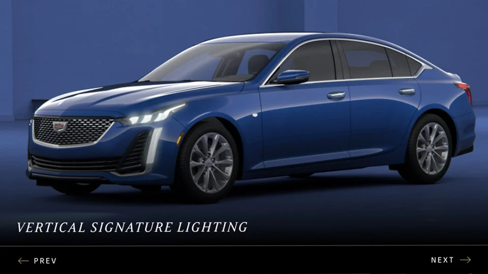
Shown 2020 CT5 - mobile
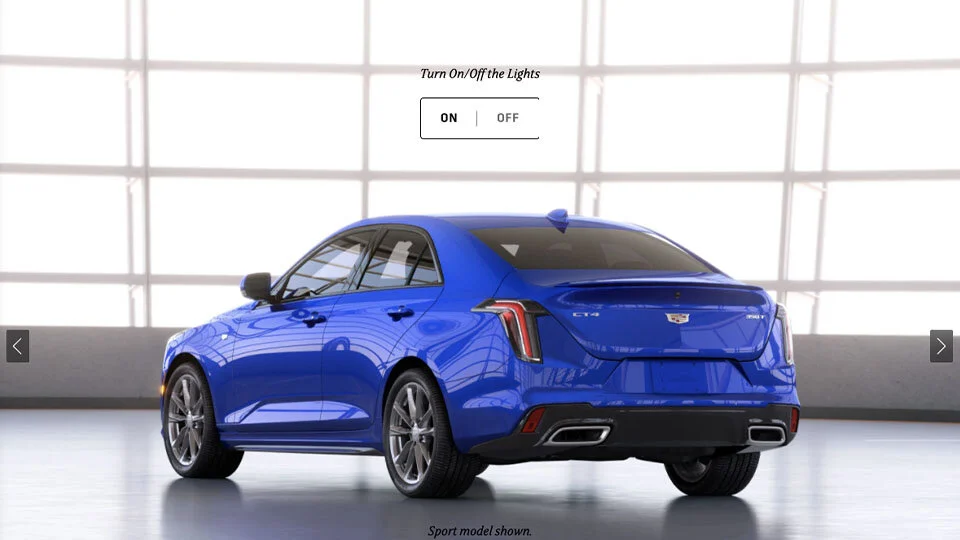
Shown 2021 CT4 - mobile
MENU ICON
The menu icon was a simple fix. Our team aligned the styling and location to more with current material design principals. Thus moving icon top left hand conner of the menu bar and having the hamburger have a more recognizable 3 bars instead of two. Since this brochure won’t be personalized we decided to remove the color chip and wheel selection from the menu for the exterior section.

MIRCO ANIMATION
In addition to the re-location we’ve added a hoover state micro animation to give added visibility and increase engagement.
Chip selectors
Lastly we decided to remove the color chip selectors out of the toast/popup. The main reason for this was the functionality seemed to be clunky in execution, and frustrating that is would be present through the section if no color was chosen. Instead we moved to have these selectors built into the page themselves so when the user left trim section for example without choosing an option, the selector wouldn’t interfere with the next page.
BEFORE

AFTER
CHALLENGE #3
Unifying cross platform brochure experiences
With all the enhancements that we were making to the new brochures with a new development team, we still have a few that were being done with the realtime platform. This created continuity issues and would create confusion and an inconsistent experience for the customer looking at multiple vehicles in one model year.
SOULTION
In order to keep as much consistency as possible we categorized our list of enhancements by importance. From there we worked with the realtime platform to see which elements of our wish list was feasible. Any enhancement that was too complicated for the realtime platform to achieve we push to the next year of updates, which the realtime platform would be completely phased out. Some of these updates included the colored background throughout the exterior chapter to align with the more white look we moving forward with. The fixes we outlined for existing UX issues and unified over all styling.
IN CONCLUSION
The 2020 digital brochure was the first iteration of the Cadillac Brochure, moving to version 2.0 version for 2021 came with many challenges and learning experience. It gave unique insights of challenges faced working with many teams and deal detail oriented nature of selling vehicles.
This high level overview of UI enhancements that were implemented from 2020 and 2021. For a more in-depth view for of UI enhancements check out the XT4 brochure story.