Blackwing Brochure
BLACKWING BROCHURE
Introduction to the reveal of blackwing
Created storyboard and lead intro animation storyboard and lead the art direction.
THE BASICS
COMPANY
Cadillac
TEAM
Leo Burnett
TIME
5 Months
MY ROLE
User Experience Designer
THE CHALLENGES
The was a piece of a greater global branding effort for the Blackwing launch. Along side the reveal brochure there was reveal page, reservation page. What makes the Blackwing standout the exclusive and limited release. The Ct4 V-Blackwing and CT5 V-Blackwing are a single trim vehicle that came with two packages. Leading our team to adjust the UI for certain aspects of the brochure:
Trim Selector
Trim Comparison section
Summary Chapter
Future enhancements
CHALLENGE #1
Trim Selector
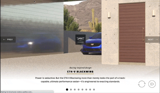
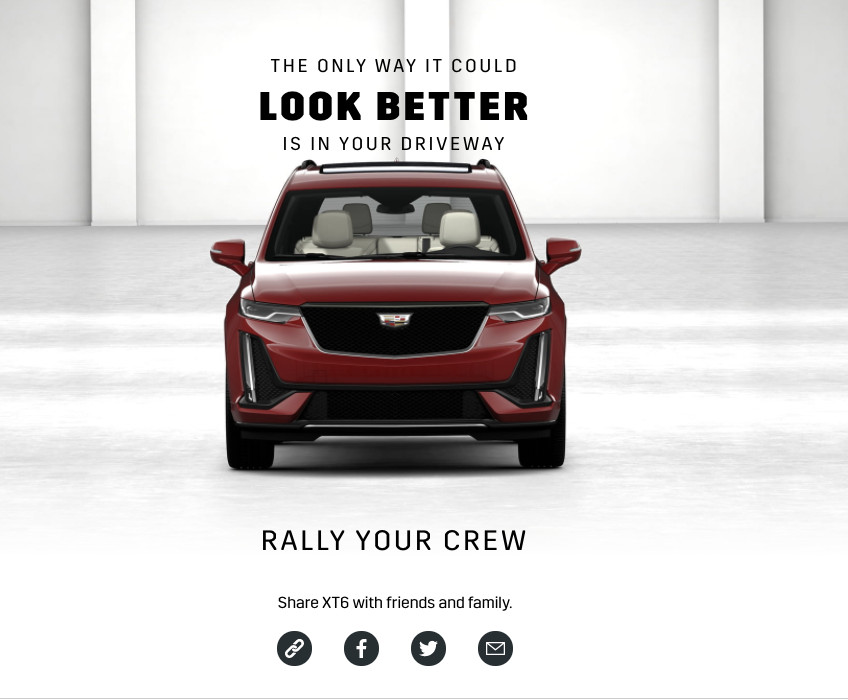
The Blackwing vehicles had one trim offered, however in the the current CMS the trim selector page could not be removed, this page was essential to link data such as the color chips, wheels and interior for the specs and trim overview page. So the only solution we could do is work with the page layout we have.
SOLUTION
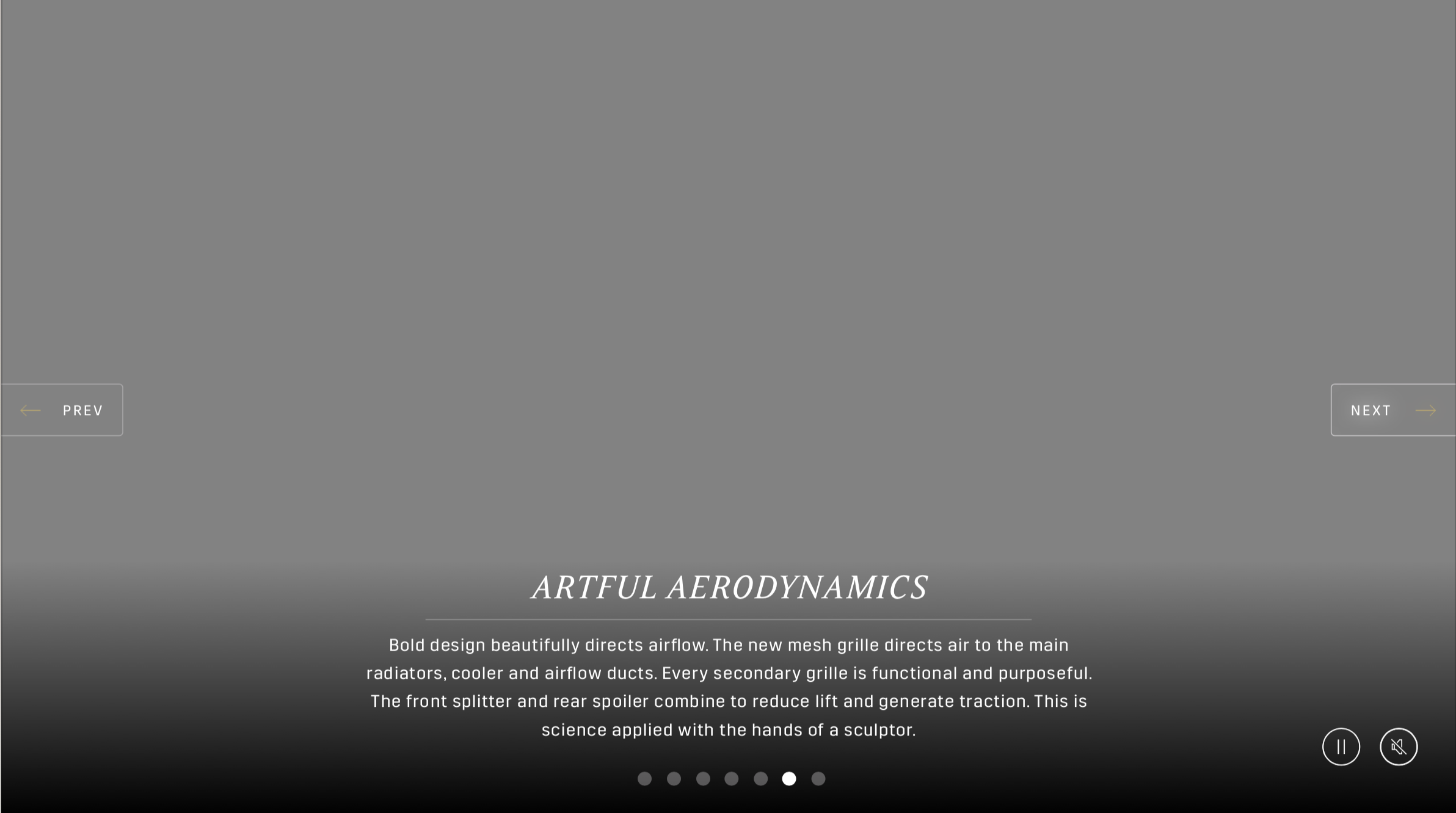
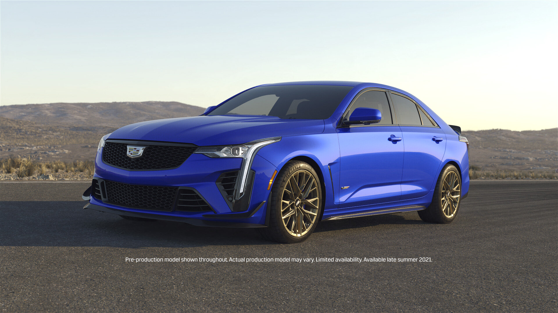
Since the page layout was a main template for the CMS, we had to figure a different approach to make this page work for our needs. One key aspect our team wanted to key was how inherently interactive the exterior chapter was. Since there was not multiple trims to toggle thru for the Blackwing series, we decided to add in an animation to add interest. Just having a 3/4 front hero shot of the vehicle would add much value and excitement. This also gave an opportunity to scenes that would build out the branding voice for the Blackwings and have a multiple views angles of the cars.
Since there was animations added in we took this opportunity to expand our video controls by adding a play/pause and replay. Which in later releases of the brochure will be added in other relevant sections.
AFTER
BEFORE
CHALLENEGE #2
Trim Comparison section
For the V-series Blackwing there was an ask to show and compare the difference of the two carbon fiber packages. These were essentially add-ons to the base vehicle for an extra charge. In previous brochure experiences there was the inclusion of the trim comparison slider widget, but the trim slider comparison could only toggle between two trims. This was an issue since the client had an ask of comparing the standard vehicle and two carbon fiber packages.
SOLUTION
Instead of trying to redesign the trim comparison module, our team took a different approach and repurpose the layout used to compare the brake calipers, which is included tabs that the user can toggle between and this module could support all three options.
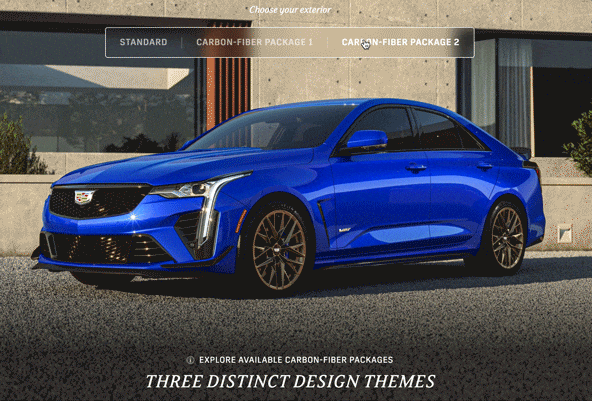
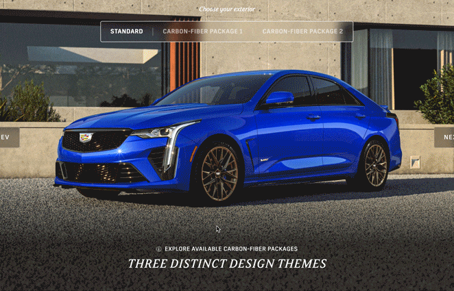
Another aspect that needed to be addressed was disclaiming that the customer would have to purchase carbon fiber package1, to be eligible to purchase carbon fiber package 2. This required a more complicated explanation that a simple disclaimer wouldn’t suffice. Instead we added an info model button that would have a popup that would house all the information about the carbon fiber packages.
CHALLENGE #3
Summary Chapter
From the 2021 digital brochure launch, our team had many struggles implementing the summary vehicle jellybean in a ways that didn’t look like it was floating. Due to the responsive nature of the platform we could never have full control of the placement for the vehicle. This grew into a bigger issue as our 3D assets started moving towards a fully developed environment.
SOULTION
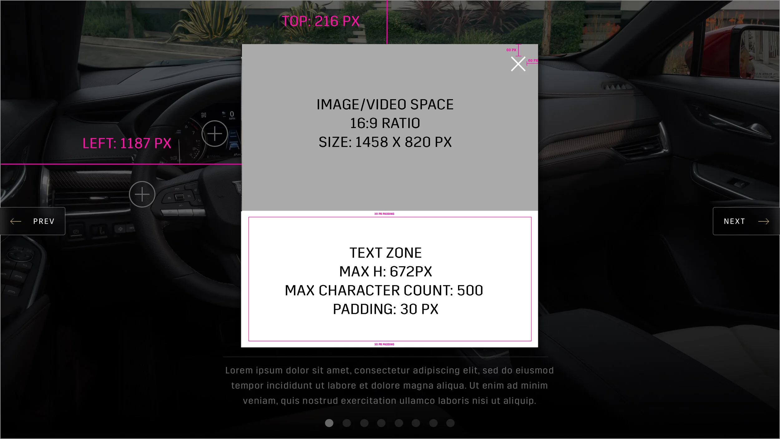
The solution was to have the summary image just be one image asset, instead of have the vehicle jellybean and background separate assets. This update, required test from our team to figure the best size for the jellybean asset so that the type wouldn’t cut off the jellybean on most viewports.
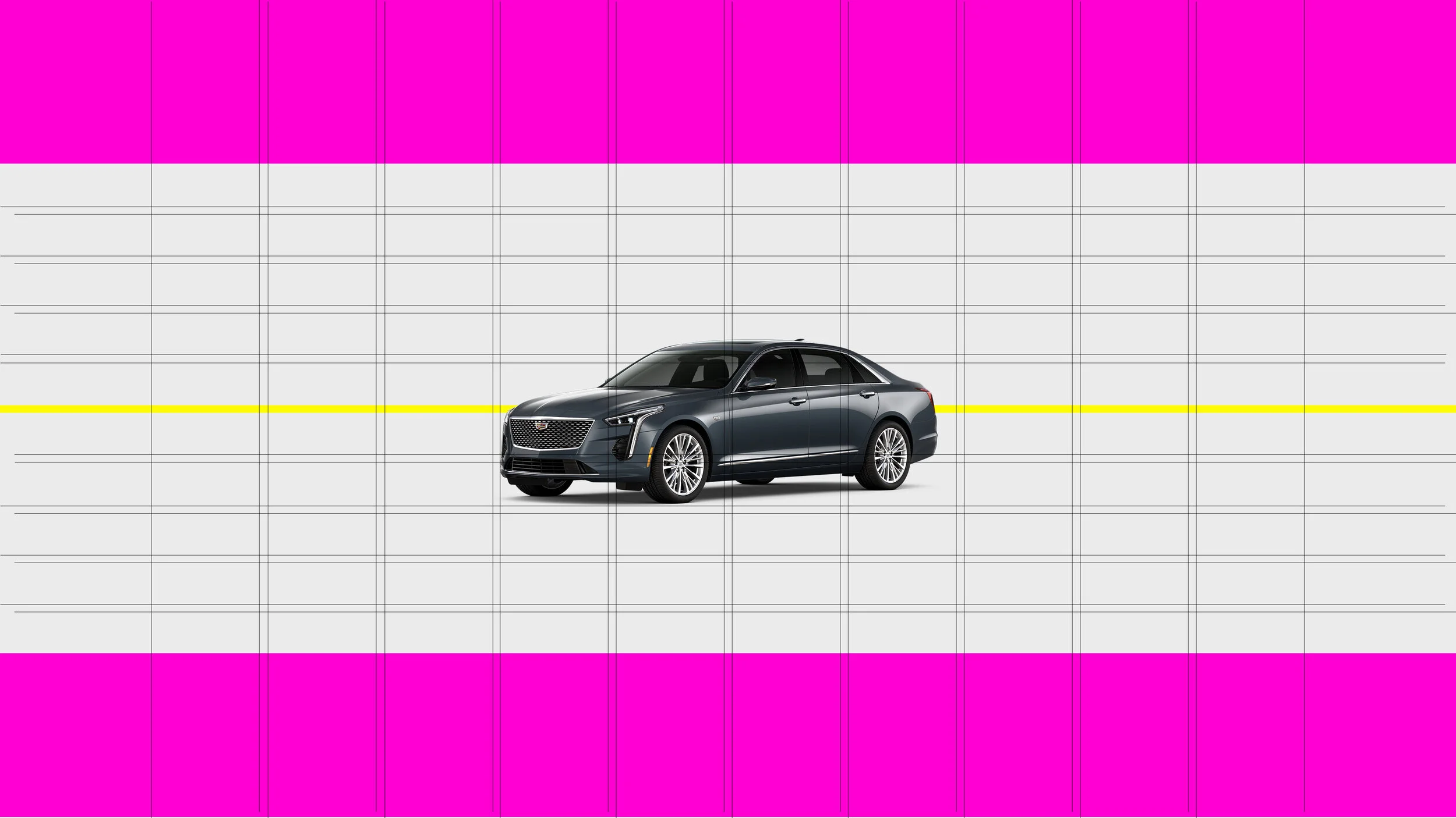
This one of the test grids for the summary chapter test. the pink areas represent the areas that would be cut-off due to the responsive functionality and the represented the safe zone. Each line on the grid was 20 px with 40 pixels in between. In order to test we put this image in the staging CMS and sized to supported tier 1 and 2 viewports for desktop and mobile.
EVOLUTION OF THE SUMMARY CHAPTER DESIGNS
STARTING DESIGN

2nd interation
FINAL DESIGN

Future Enchancements
There many fun and interactive items that our team wanted to include for the V-series Blackwing launch, but not all our CMS and creative asks could be included in this brochure. There were timing and budget concerns to take in account and the team had to make a decision to only move forward the highest priority requests.
Any enhancements that our team decided to table for this round of update would be carried out at a future date with a sprint cycle approach. Some aspects were rolling releases that were in development in tandem to our Blackwing brochure launch. Some of these items were the video controls added to the intro animation, hotspot model pop and having the ability to have video content used in any section of the brochure.